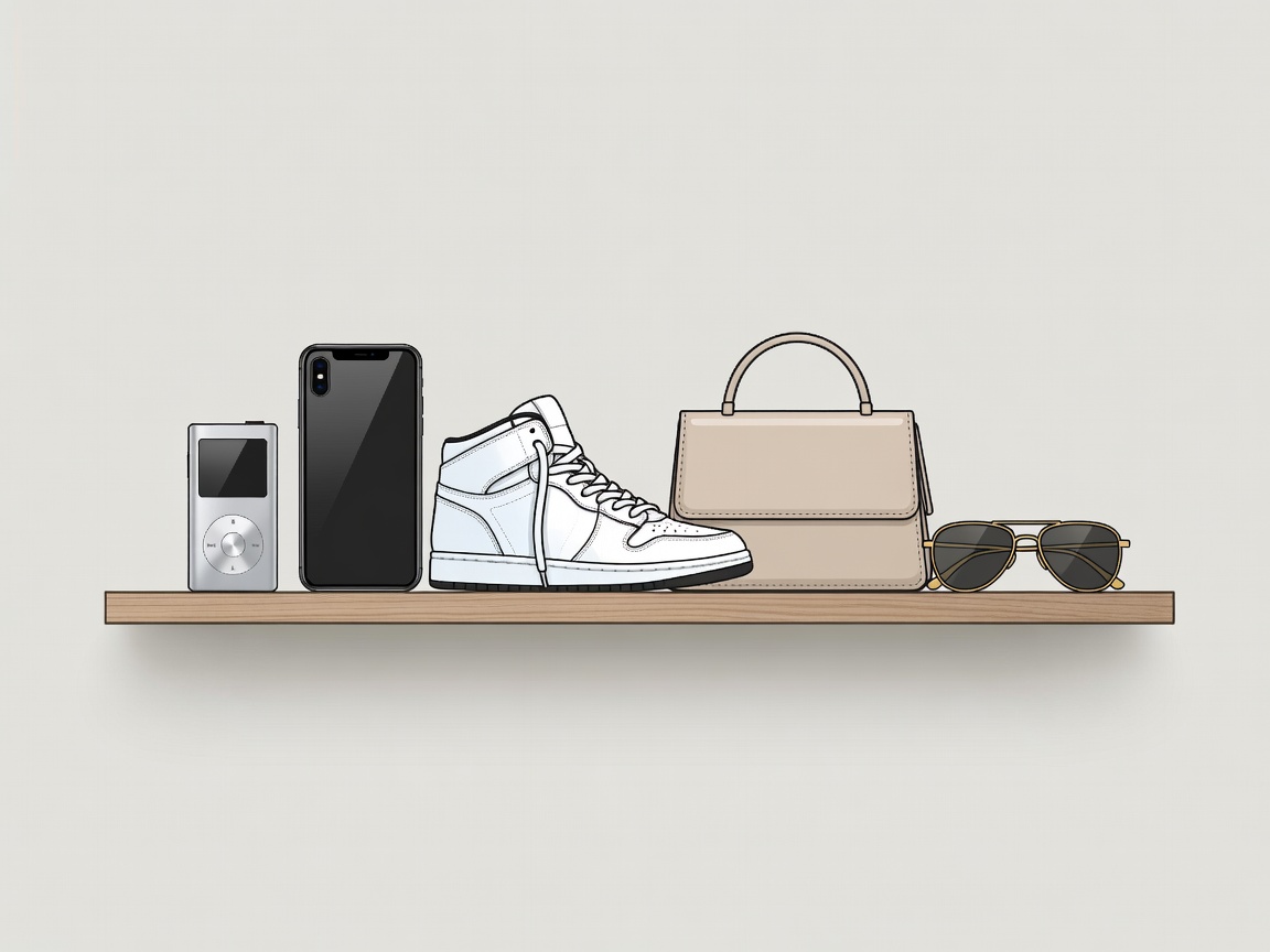
Objects you can draw from memory
The iPod arrived in 2001, and the advertising campaign that followed did the iconography rather than the engineering: a black dancing figure on a saturated flat colour, with two white cables. The product was legible as a shape at fifty metres. The iPhone in 2007 replaced buttons with a slab of glass and made every subsequent phone look approximately like it, which is what winning a design argument looks like in practice. AirPods, from 2016, were widely mocked as visible stems in the ear and then became so ordinary that the mockery reads as a period detail.
The test is consistent: reduce the object to an outline and see whether anyone still recognises it. Most consumer electronics fail immediately, which is why so much of it is sold on specification sheets instead.
The sneaker as cultural document
Nike's Air Jordan line began in 1985 and has spent this century as a continuing release programme rather than a product, with silhouettes reissued, recoloured and collaborated on. The adidas partnership with Kanye West produced Yeezy footwear for several years before adidas ended the arrangement in 2022. Resale platforms such as StockX turned trainers into a secondary market with a public price history, which changed the product's meaning: a shoe became simultaneously a garment, a collectible and an asset.
The design consequence is visible on the shelf. Chunky soles, deliberately aged materials and restricted colourways all exist because scarcity has a look, and the look sells even when the scarcity does not.
Streetwear and the luxury house
Supreme's identity is essentially one asset: a red rectangle with white condensed italic type. It is the purest demonstration of the century's branding logic — the mark does everything, the garment underneath can be a plain cotton T-shirt. The Louis Vuitton collaboration in 2017 formalised the truce between skate brands and the luxury sector, and Virgil Abloh's appointment as artistic director of Louis Vuitton menswear in 2018 confirmed that the traffic was permanent.
The trade-off for the luxury houses is legibility versus mystique. A logo you can spot across a station concourse sells accessories; a house with no visible logo sells to a much smaller room. Most brands have spent the century oscillating between the two positions and calling each swing a return to heritage.
The Met Gala as an annual costume brief
The Costume Institute's benefit at the Metropolitan Museum of Art in New York is tied each year to the exhibition it funds, and the announced theme functions as a brief: "China: Through the Looking Glass" in 2015, "Heavenly Bodies" in 2018, "Camp: Notes on Fashion" in 2019. Because the theme is public in advance, the event has become the one occasion where mainstream audiences read clothes as arguments rather than outfits — and where an outfit's afterlife is measured in image circulation rather than reviews.
The great flattening
From roughly the early 2010s, a substantial number of fashion and consumer brands replaced distinctive wordmarks with wide-spaced geometric sans-serif capitals. Saint Laurent's rebrand in 2012 and Burberry's in 2018 are the widely cited examples; a long list of others followed. The commercial logic was screen legibility at small sizes, and it worked — at the cost of every logo becoming interchangeable in a shop window. The subsequent drift back towards serifs, ornament and revived house scripts is best understood as a correction rather than a revolution.
Interfaces went the same way. After iOS 7 in 2013, the textured, shadowed, imitation-leather style of software design was retired in favour of flat colour and thin type, and the whole industry followed within about two years.
Deliberate ugliness
The most interesting design story of the period is the rehabilitation of the unattractive. Crocs — a moulded clog with ventilation holes, designed for boating — became a fashion item complete with luxury collaborations. Balenciaga's Triple S turned the orthopaedic trainer into a statement. The closing shot of Barbie in 2023 used a pair of Birkenstocks as the punchline to a film about aesthetic conformity, which is about as neat a summary as the decade offers.
None of this is accidental. When an aesthetic becomes universally available, the only remaining way to signal taste is to select something the algorithm has not yet endorsed, and ugly is the largest unclaimed category.
How to judge a design icon
- Silhouette. Recognisable as an outline, with no logo and no colour.
- Imitation. Competitors copied the form rather than the marketing.
- Survives the copy. The counterfeit market is an unwelcome but reliable indicator of iconic status.
- Institutional interest. Objects collected by the Design Museum in London, the V&A or Cooper Hewitt in New York have cleared a curatorial bar as well as a commercial one.
For further reading, the collections databases of those museums are searchable and free, and rather more reliable than any list that begins with the words "the most iconic".